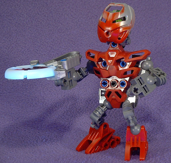
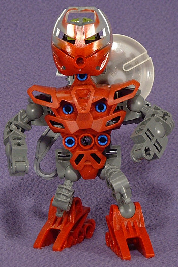
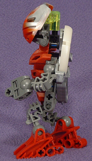
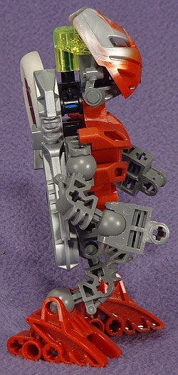
Gone is the childlike cuteness of the original McTORAN design. The new METRUAN are at least 50% taller with a trapezoidal torso that suggests a heavy weightlifting regimen. They look less like innocent villagers that require protection and more like junior TOA.
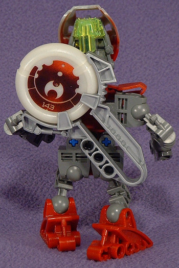
This is the torso shape that I’m least happy with as it looks more like a piece of armor plating that should be attached to some other torso. It works from the front, but from the back the body looks cobbled together. A torso piece should at least have the illusion of a solid core, but this, like the TOA NUVA limb, is quite hollow looking.
The tiny little bent limbs and the restricted positions of the socket joints make it extremely difficult to pose these guys in a way that doesn’t make them look like they’re just about to start a sumo match.
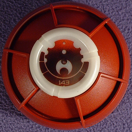
The basic KANOKA launcher works better than VAKAMA’S launcher, but it still doesn’t have nearly the range of the McTORAN throwing arm. It does make up for this with greatly improved aim, though.
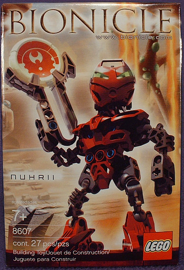
The color scheme detracts even further from the innocent look originally enjoyed by the MATORAN. Between the bright blue plus/pins (those really need to get swiched back to black), the bluish tint of the gunmetal grey, and the muted dark-red of the rest of the body, it doesn’t really invoke images of bright roaring infernos like the original color scheme did.
The one really interesting new change is the switch to two-tone KANOHI. Previously, the only KANOHI that was formed in a mixed color was the POISONED HAU NUVA, for which the second color was intended to represent the LERAHK poison running through TAHU NUVA’S veins. These are just meant to be two colors.
0 Comments