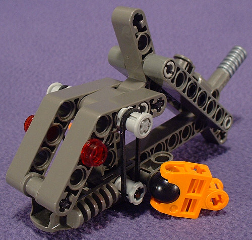
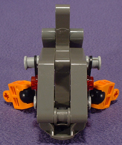
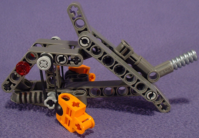
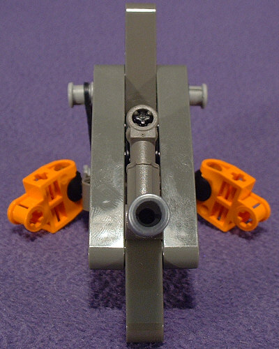
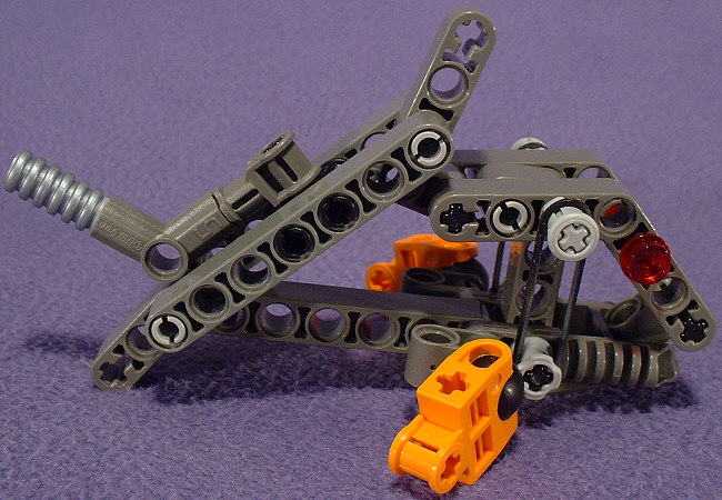
Again, those two little orange pieces completely throw off the color scheme. Aside from that, it’s a fairly interesting design. The overall look is somewhat shaped like a fat little goldfish, but with the feel of it is more like a piranha.
I never would have thought of the hip-joint as a fin on a fish, but they work, and they even allow for realistic posing. I’m not fond of how the top fin leans forward in such an unnatural way, but the use of a ROBO-RIDER™ head as the lower jaw lends it a nice streamlined fishy look, in spite of how boxy the rest of it looks.
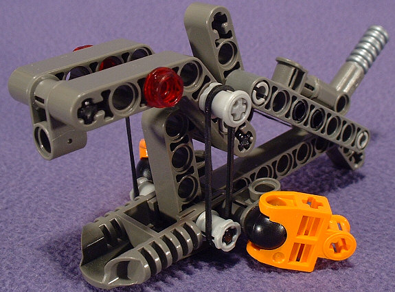
Of course the thing that makes it such a cool design is the mouth. According to the instruction booklet, pushing forward on the dorsal fin will causet he mouth to open. I found that squeezing the body of the tail (not the tail-fin, but the actual tail), like on MUAKA and KANE-RA, works best, and will cause the mouth to open a good 1-1/2″. Granted, the single-tooth look of the upper jaw looks a bit weird, but with how big the mouth gets, this looks to be a beastie that the GA-KORONAN villagers need to keep an eye out for when swimming or diving.
0 Comments