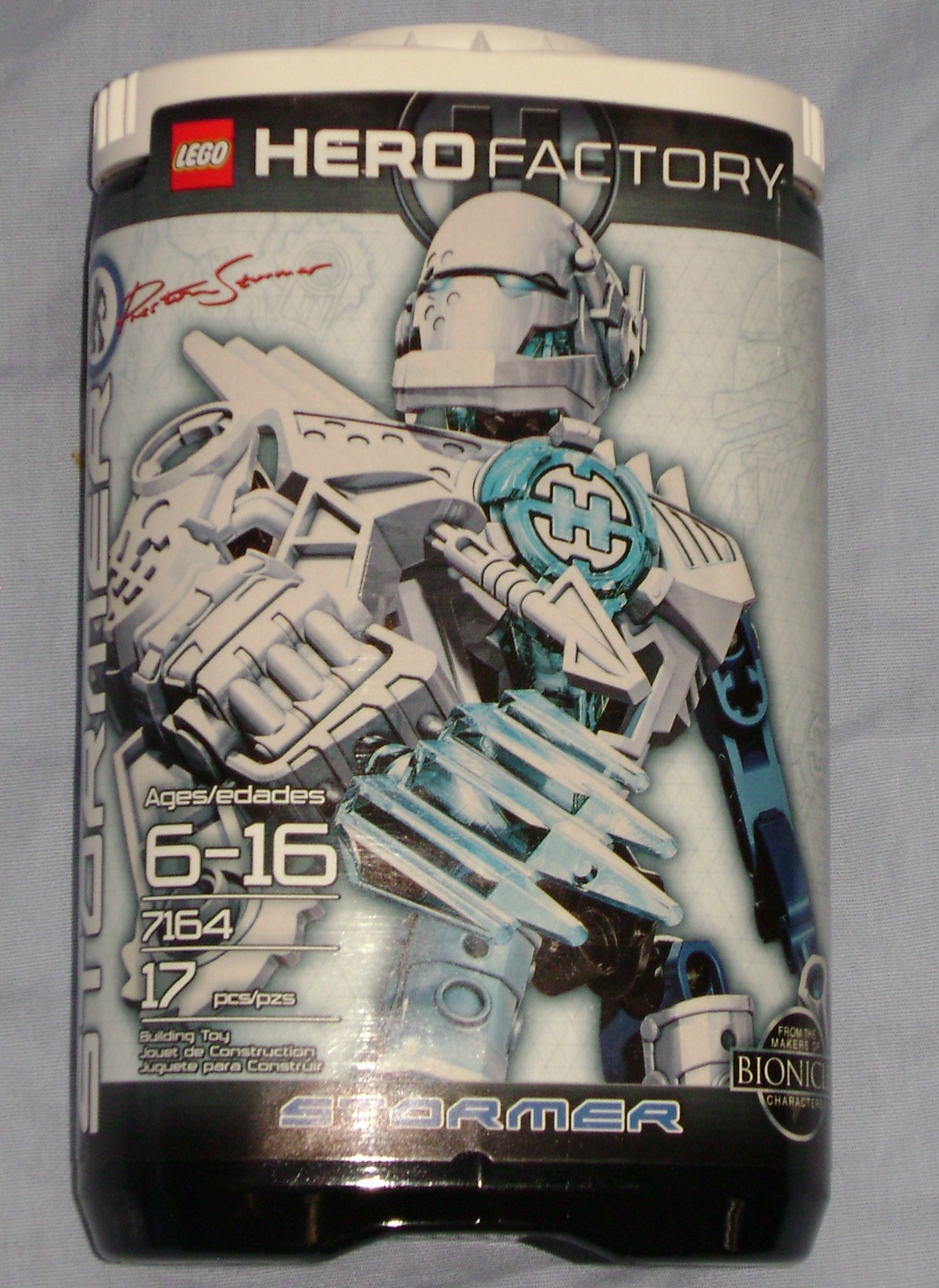
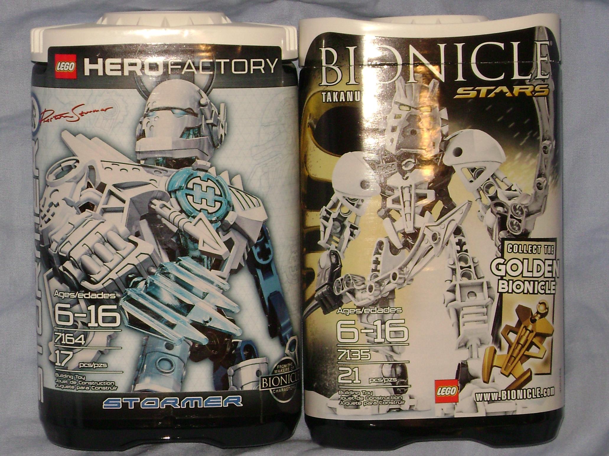
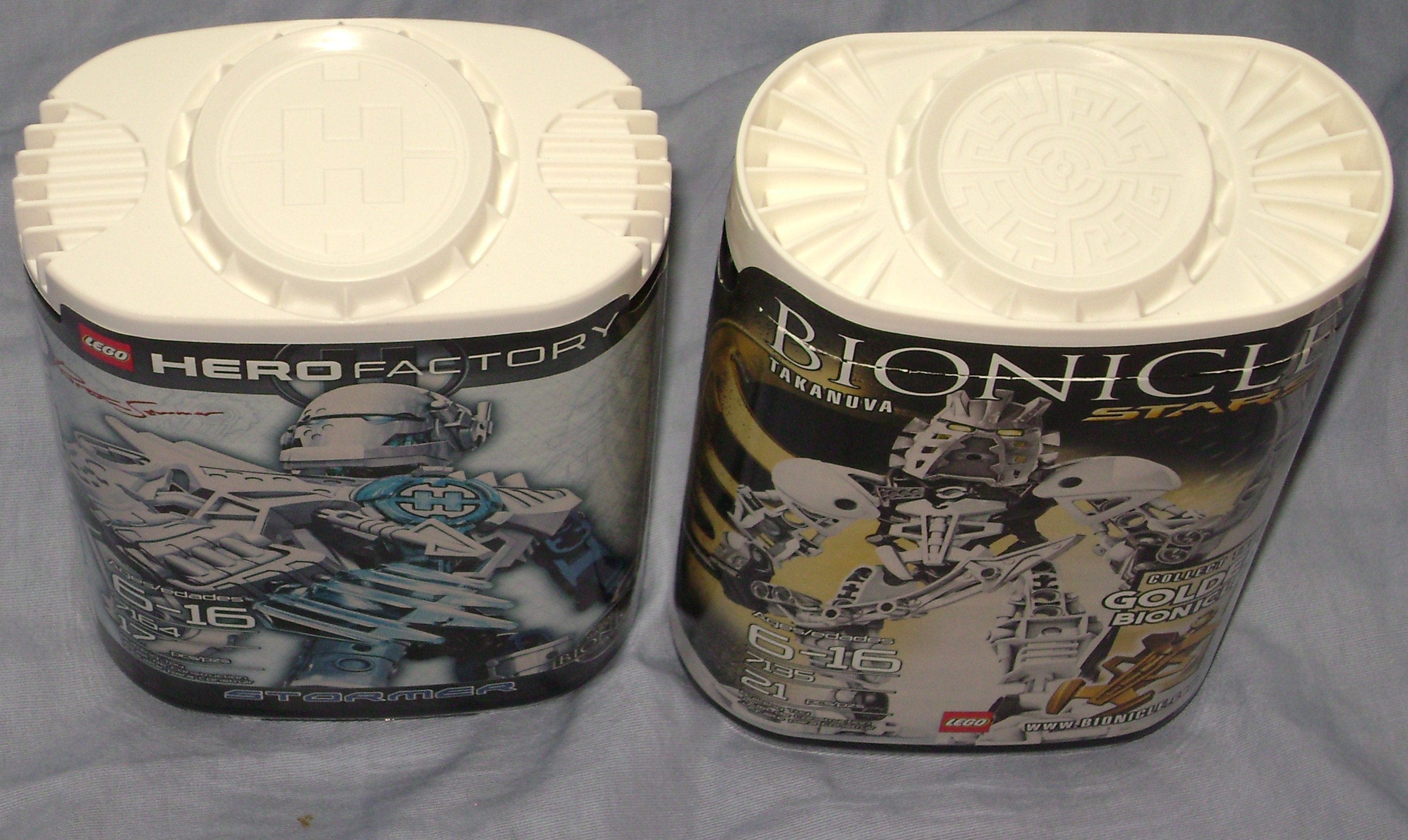
The Hero Factory cannisters are very similar to the BIONICLE® Star sets, the only noticeable difference being changes to the lids. Functionally the lids have downgraded (in my opinion at least), because the star cannister lids have raised edges that grab the bottom of a cannister stacked onto it, while the Hero Factory cannisters have rounded corners, meaning that the grooves wont prevent any containers on top from rotating in odd directions. Visually, the key difference on the lids is the big H that replaces the skrall shield emblem, and the downward curves that work well with it. You will notice this H as well as H-like designs on several parts in the Heroes.
Moving onto the sticker art, they pushed the emphasis on his big clunky arm, the torso with it’s circular blue power core, and the helmet. Thank goodness they didn’t give Preston the red and gold color scheme, otherwise they might be hearing from Marvel’s lawyers. Little effort is made to show off the legs, which are a strong selling point of the design, and the left blue arm is visible but hardly noticeable amongst the other features. The left hand is also hidden by a sticker, saying “From the makers of BIONICLE characters” which itself seems to imply “by the BIONICLE toy designers, not the writers”. If you take the time to look closer, you will see a light blue diamond patterned background with blueprint-like etchings of Preston, his hero core, and a smidge of his weaponized arm. Towards the upper left corner, in the form of a signature similar to that of the Piraka cannisters, is the only trace of his first name. With first names like Dunkan and Preston, I can understand why they might hide them (for the sake of people who buy on impulse?) but have them established for those who get attached to the story and want that kind of character development. Whatever the reason, “STORMER” is the name we notice, and even that is dwarfed by the upper-body attention.
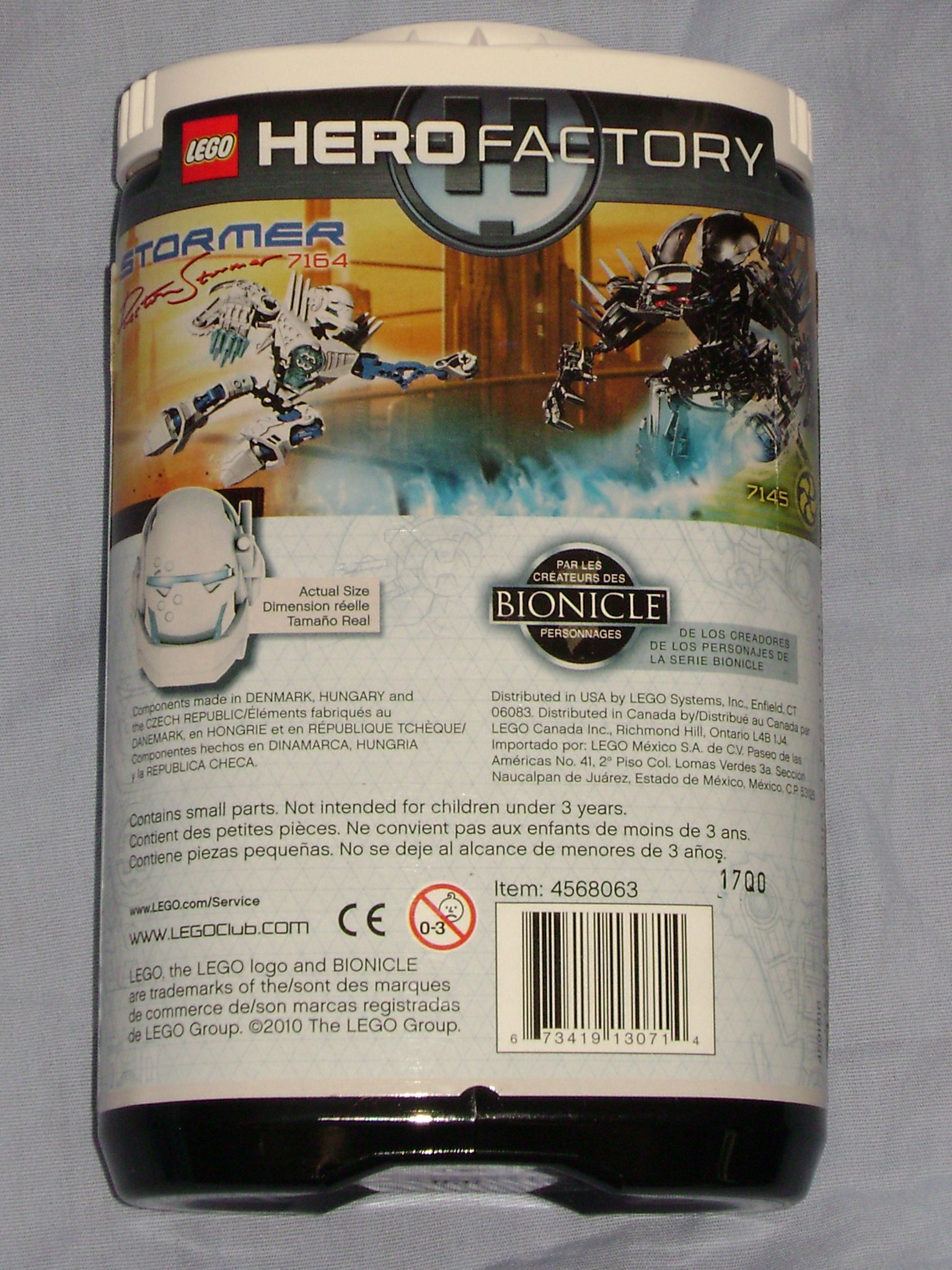
The back of the sticker is more than half text and warnings, and information from the front restated in other languages. Above all this text is a battle scene with Preston jumping fist first over a blue flame toward Von Nebula, who’s staff is generating the fiery attack. Preston’s pose in this shot is actually impossible to make, since his knee’s and arms don’t really bend.
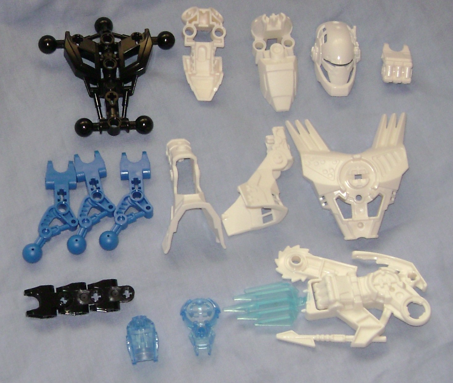
Aside from the sockets, left hand, and glatorian skull, there are no recycled parts, and each one is a welcome addition to a MOCer’s part supply (maybe excluding that big clunky arm)
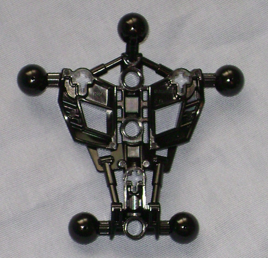
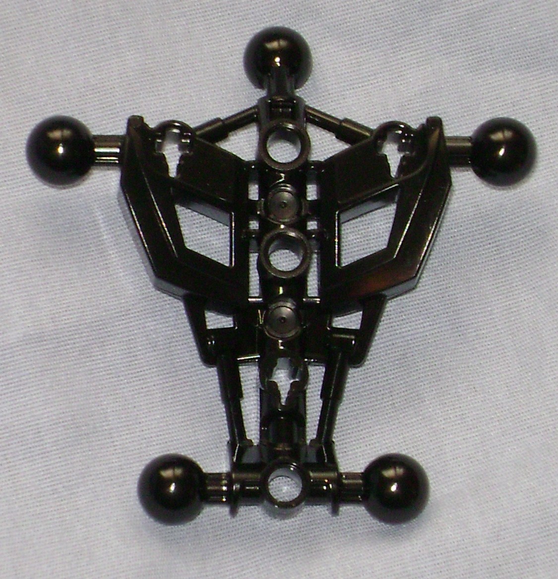
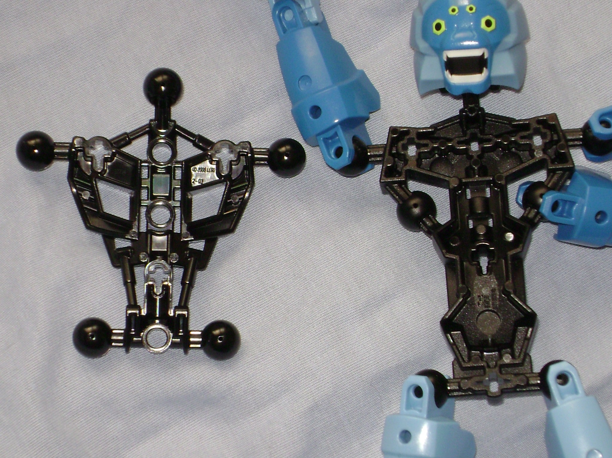
This part reminds me of the humanoid exoskeletons in the Terminator series. By itself, its much more interesting to look at than the parts they used in the last few generations of agori and matoran. As interesting as it is to look at on it’s own, its a great piece to decorate and more compatible for MOCing than the old torsos. Comparing it to my Ben Ten Spidermonkey set, which seems to be where the design originated, this smaller version lacks the sockets for the additional arms but feels sturdier, and looks shinier. I wouldn’t have complained if they kept the extra joints from the ben ten version, it seems like a rather useful feature to have so i wonder why they didn’t keep it on this shrunken variant?
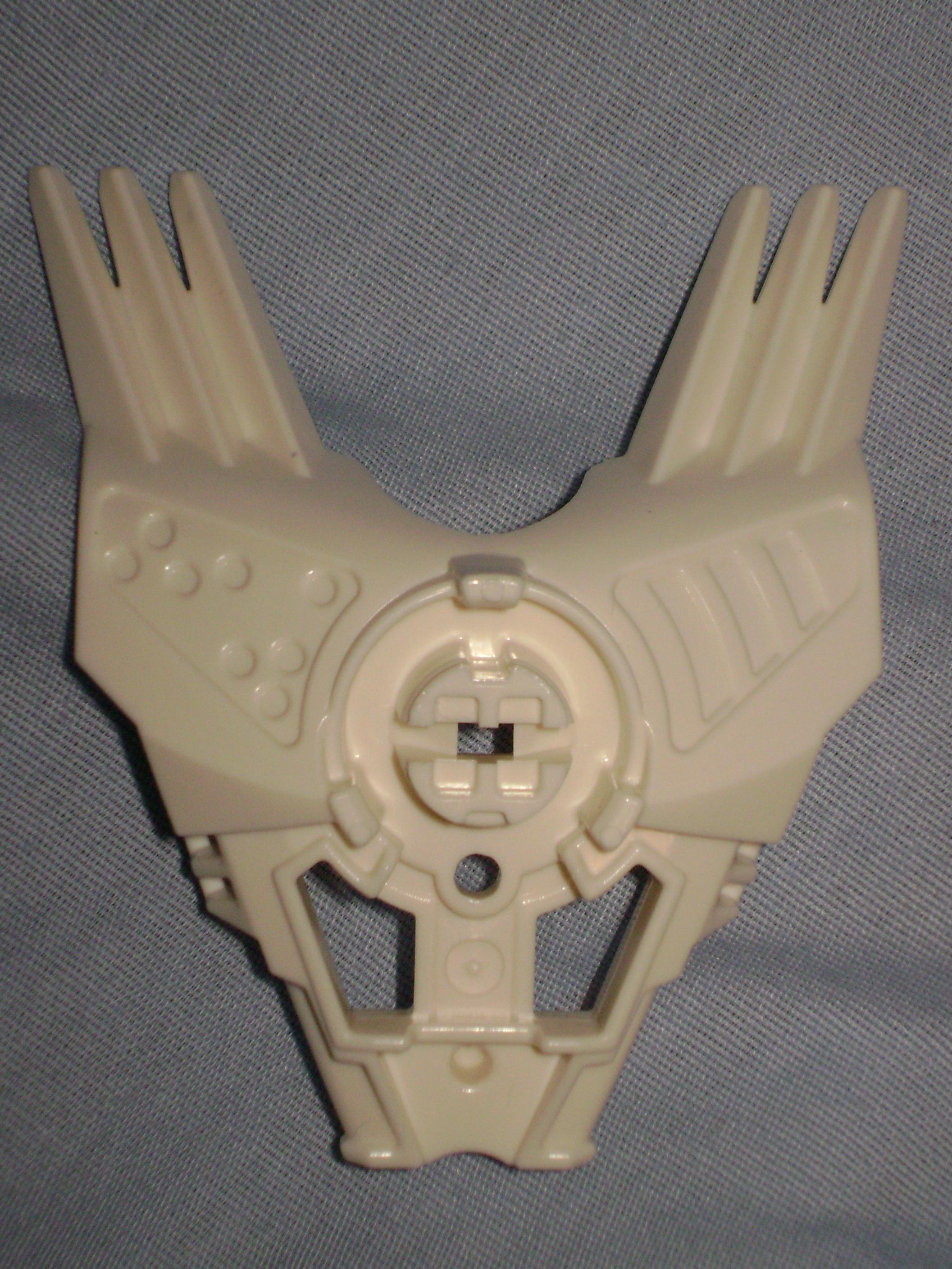
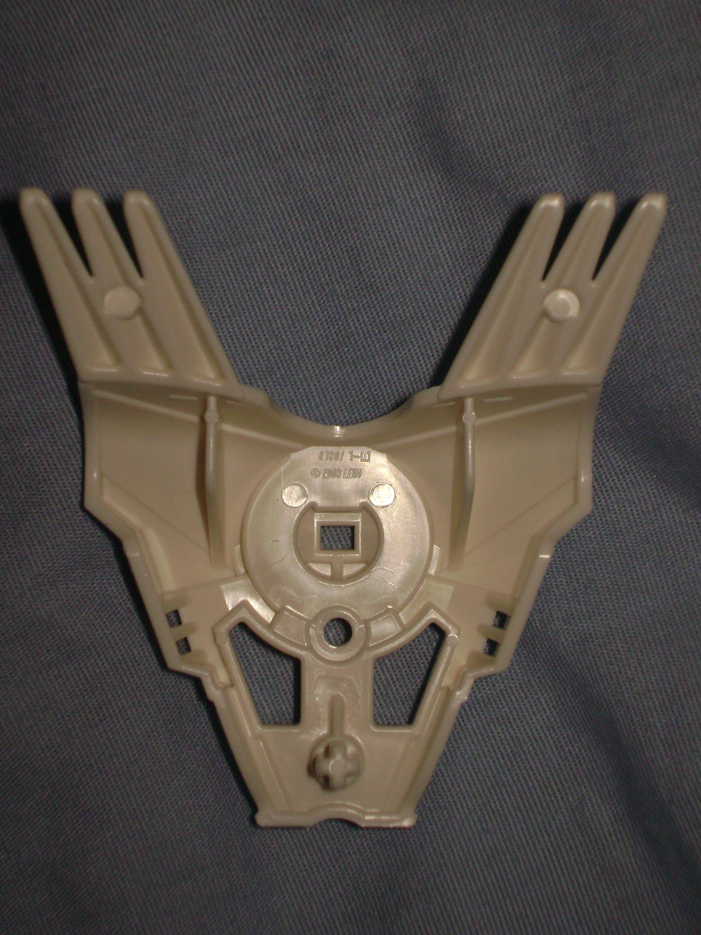
The torso armor here plays a large part in the character design. Besides being where the Hero Cores plug in, its what ties the whole set together and defines this as being a Hero Factory character rather than a Glatorian or BIONICLE set. The part itself is very sturdy, but mostly hallow underneath. It would be a really useful part for MOCing if only it had at least one more peg to anchor itself to a model. I wonder why they didn’t place two pegs, one on each support, where it already lines up with two of the holes on the skeleton? There is also some asymmetry in the torso, the left side has a spotted pattern rather than the stripes. This seems to be coordinated with his asymmetrical helmet, which also has these spots on the left side. There are four different shapes of torsos between the six Hero Factory sets, and Preston’s is a unique one amongst them.
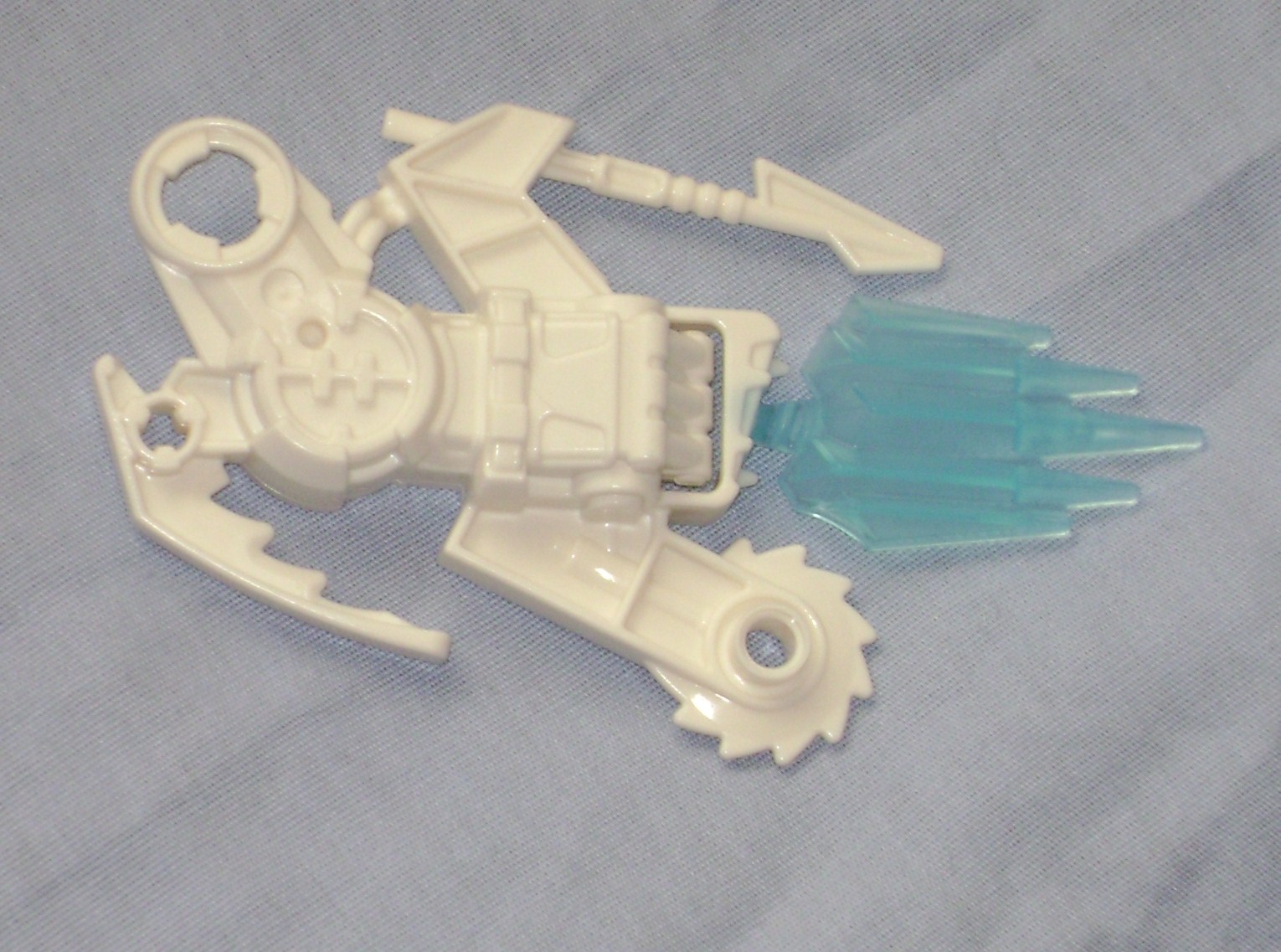
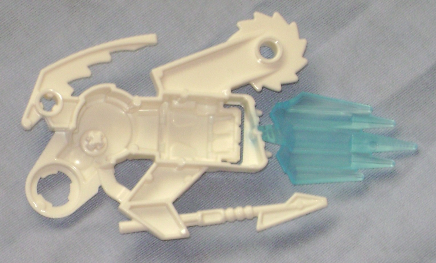
This part is my least favorite, and thankfully only three of the cannister Heroes have this style of weaponized arm. It’s supposed to look like an arm carrying a gun of some kind, but it’s ugly and not the kind of part that is good for MOCing. It’s good an bulky, which matches the rest of his design quite well, but all this stuff just looks slapped together, and I’m afraid that the blue ice (which is a little rubbery) and the spear might break off in storage or with a lack of good care. There is one nice detail in that the hand is molded to match the glatorian hand on his left arm, and we see that H design on the elbow, but that is the only thing that really interests me about this part.
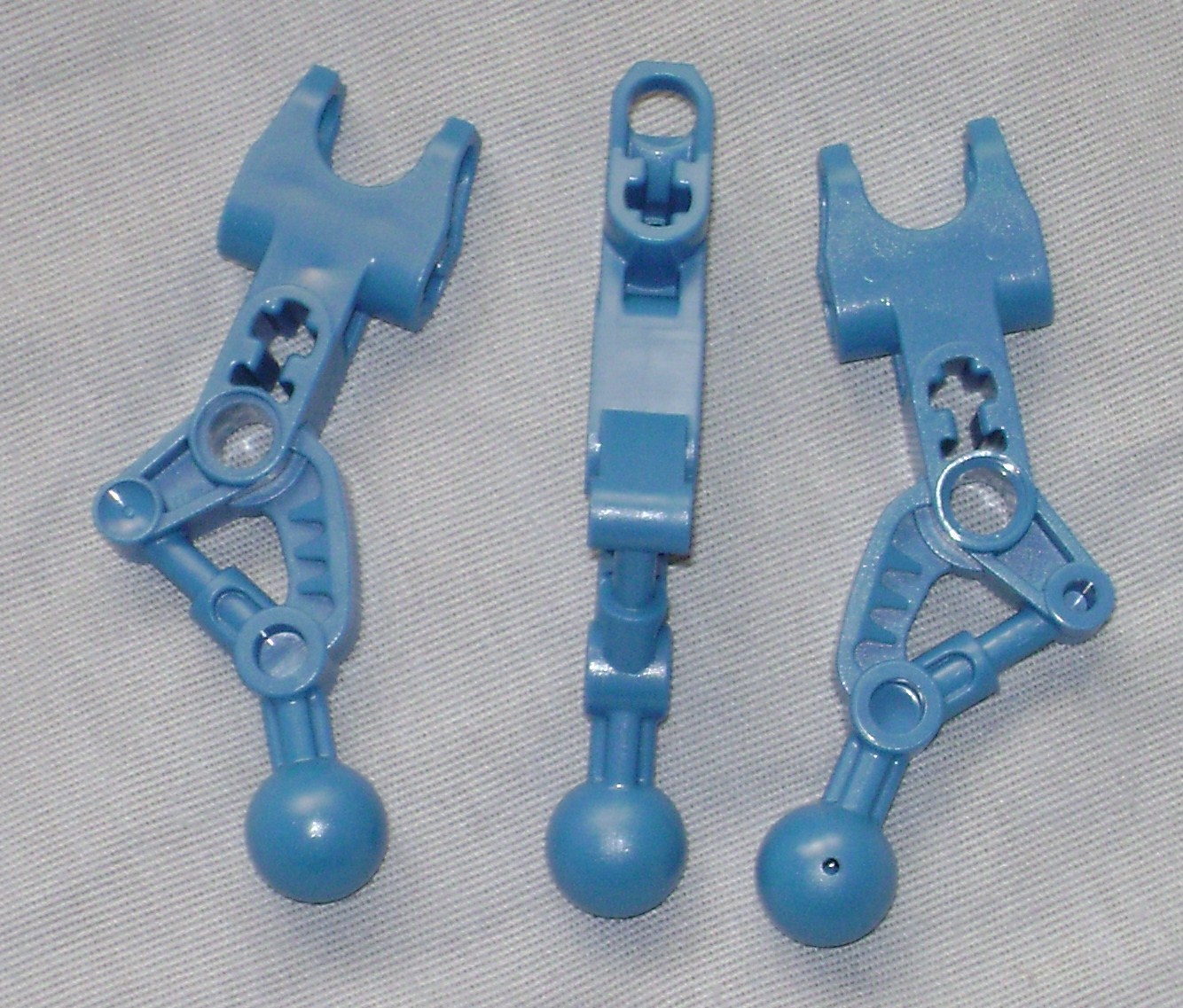

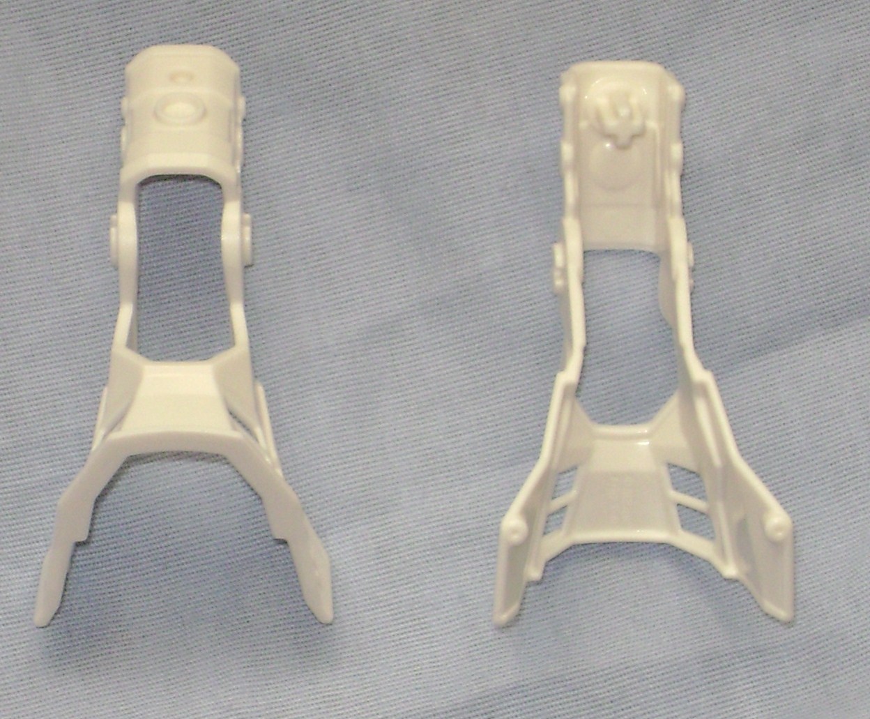
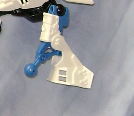
The leg/left-arm parts are probably one of the most useful MOCing parts we will get out of these guys. By itself it’s not much but the axle and peg holes should prove very useful. The armor that attaches to them also looks promising, but since it was tailored to the leg/arm part, it’s odd angles and single plus-peg connector may make it useless, unless you build a MOC around the idea of using this specific piece of armor.
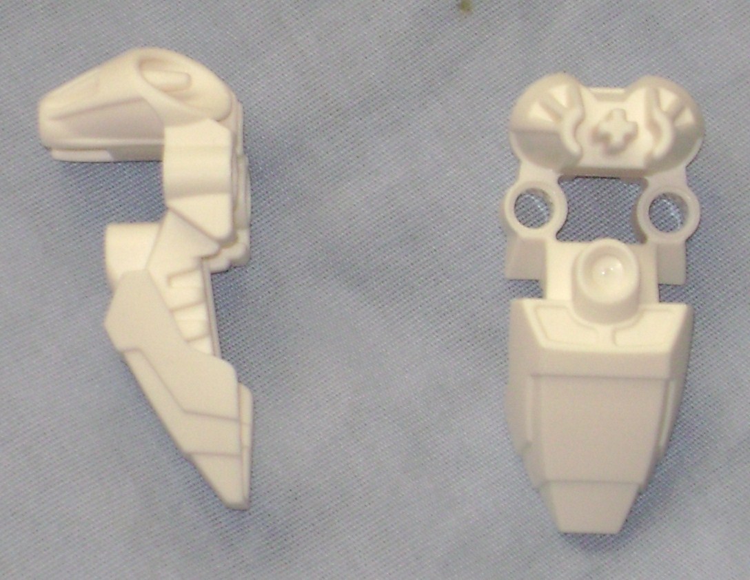
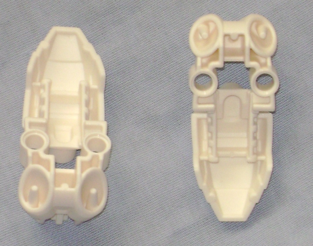
These are one of the more interesting feet I’ve seen in a few years. They are tailored to work with leg armor to cover up an otherwise ugly ankle, but they look to be versatile for MOCing when not used specifically as a foot.
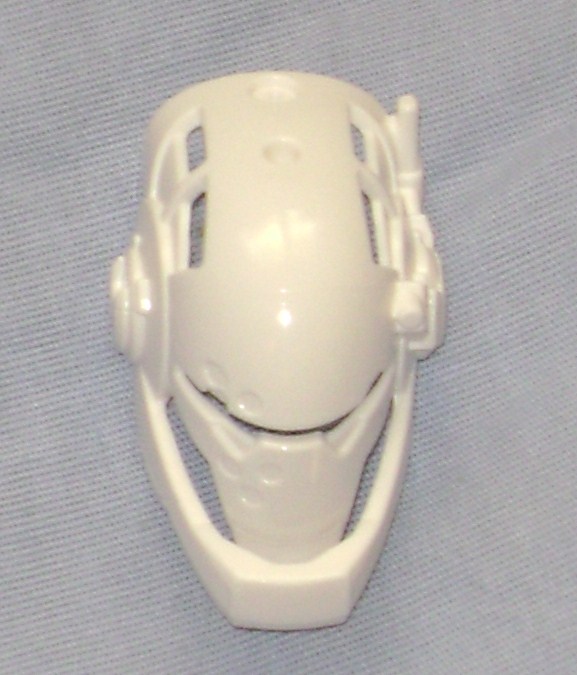
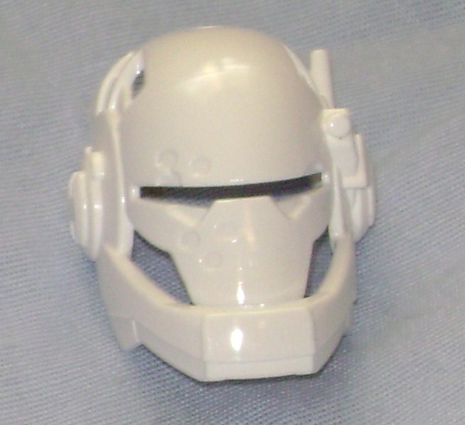
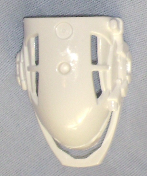
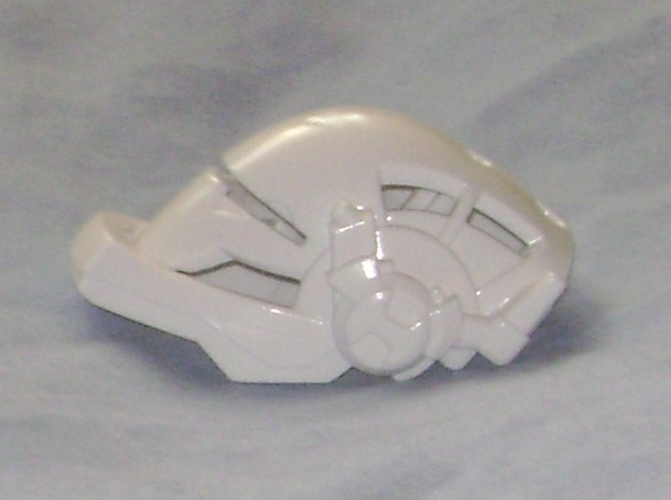
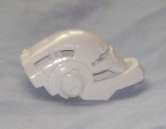
The helmet is very nice, with matching details like the rounded H for the theme, which matches the arm, legs, and the core, but its not so prominent that it would stand out on a MOC. It also has the spotted patterns on the left that match the same side on his torso. Each hero’s helmet is slightly asymmetrical due to external communication gear molded into it.
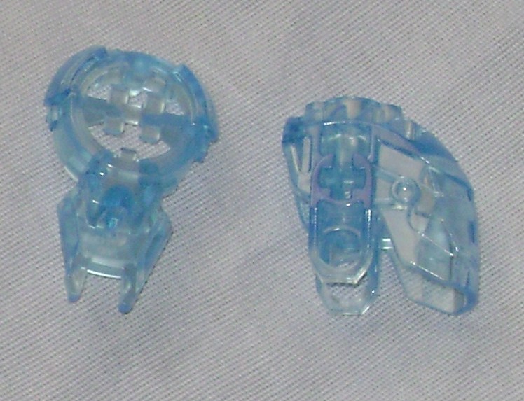
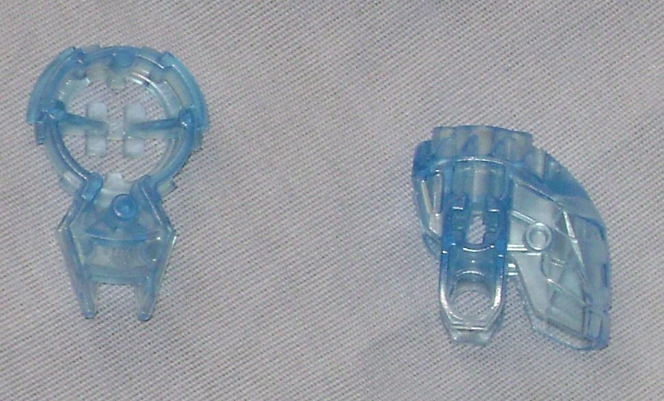
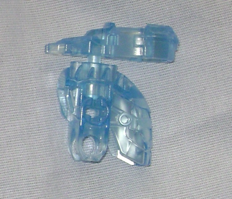
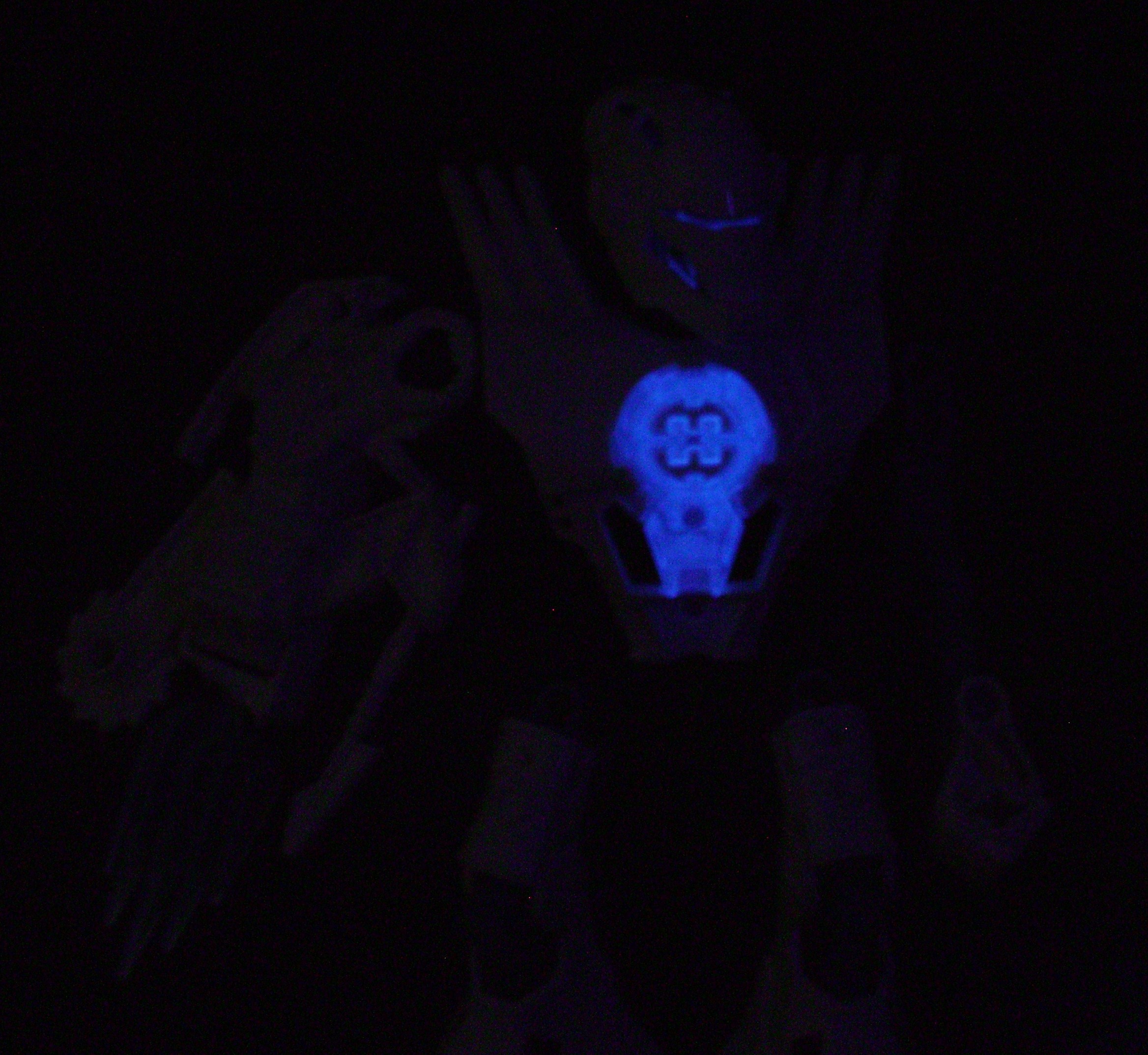
This would be the Hero Core, which I think may have evolved its design based on the chest armor from the BIONICLE Star sets and the collectible Atlantis keys from the “Atlantis” theme. Each Hero comes with a different color core, which is probably to make them seem more collectible. The colors seem to have been limited based on glatorian skull colors, as each Hero’s core either matches their skull/eye color, or is a similar color to their skull/eye color. The center contains an H which lines up with the indentations on the torso, so each hero’s core has their primary color incorporated into the core when it’s plugged in, no matter how you mix them up. What actually holds the core into the hero’s chest is a standard little circular peg that can fit into the smaller holes of certain BIONICLE parts or into the + peg holes. If you want to pull the core out, each core has a raised edge on the lower part of the core which your fingernails can grip. Of the six core colors, Preston’s light blue core is one of the three that glow brightly under a black-light.
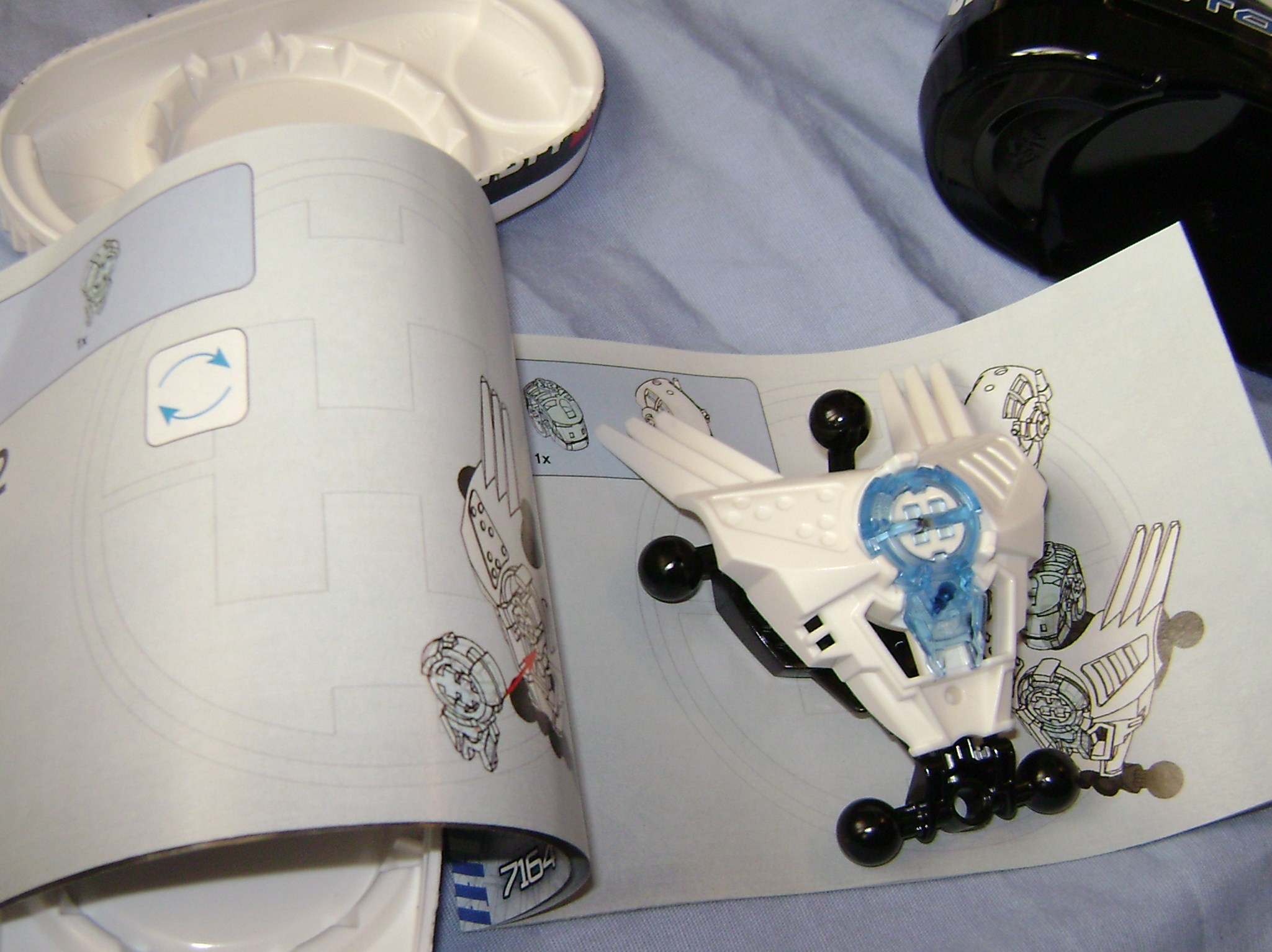
Construction is pretty simple, and the instructions probably could have been reduced to one of those older folded-up one page manuals, rather than a multi page book. Most kids can probably assemble it without the instructions in less than thirty seconds.
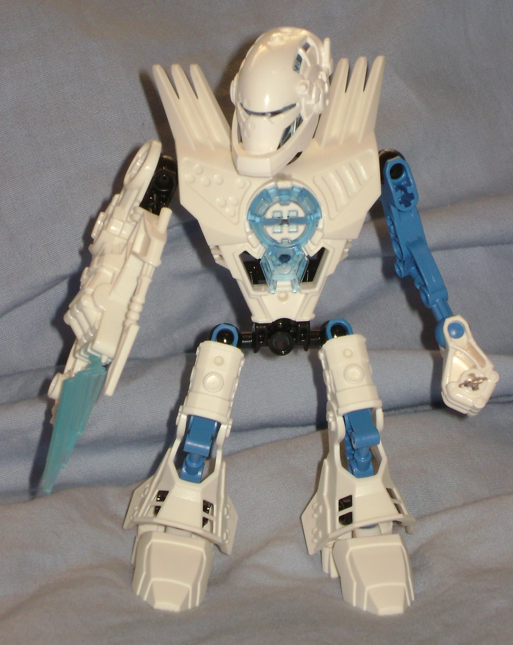
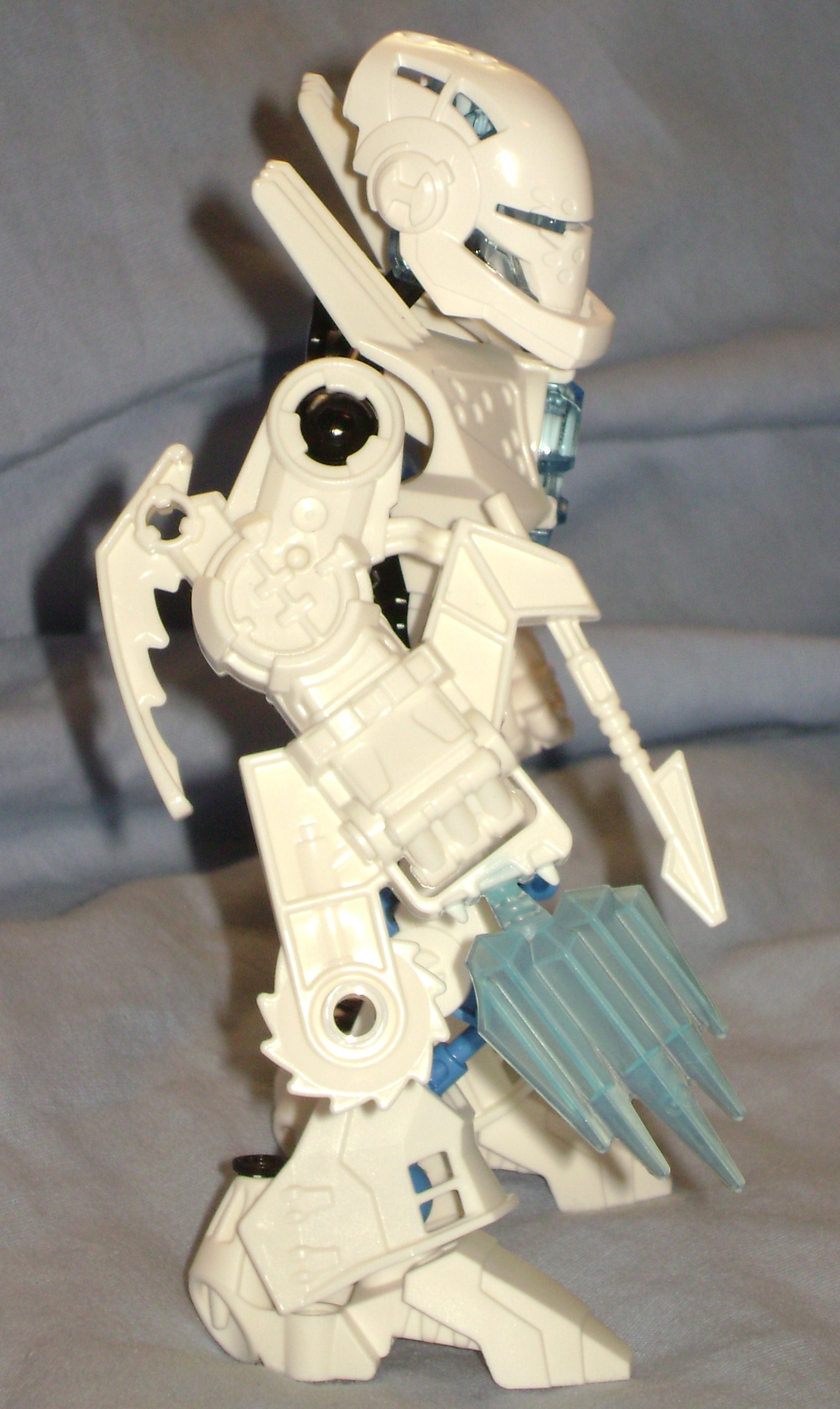
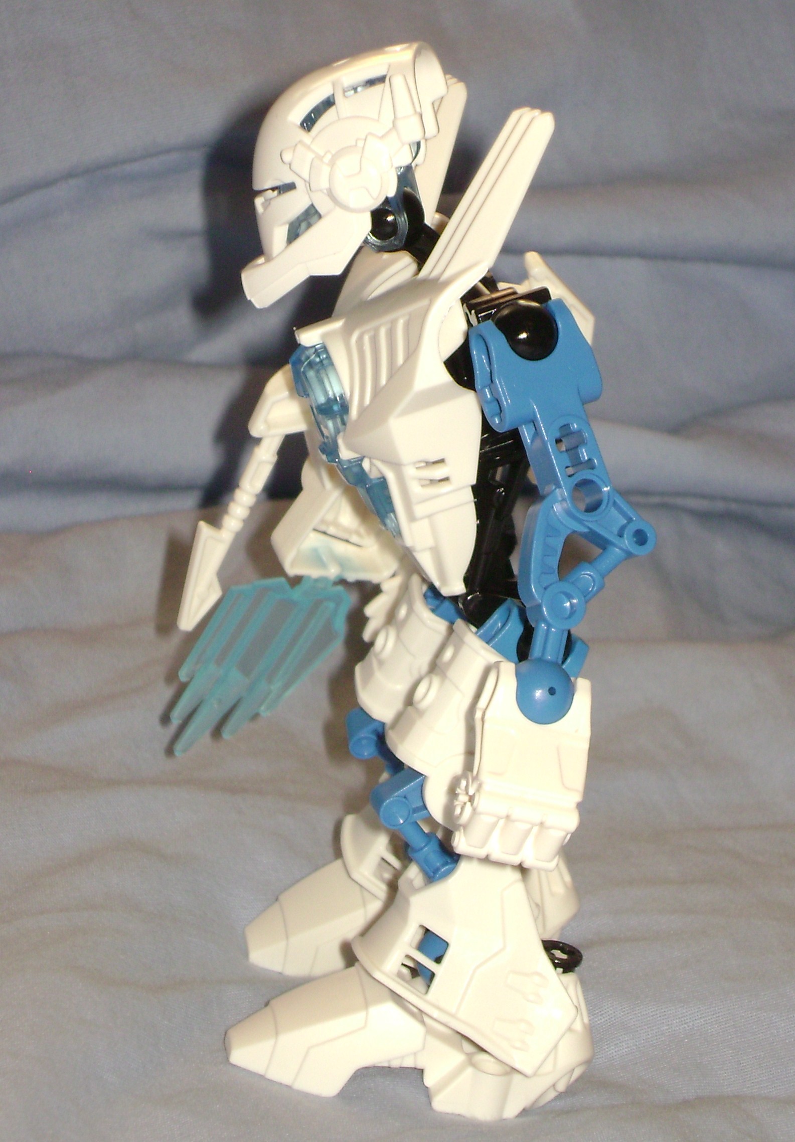
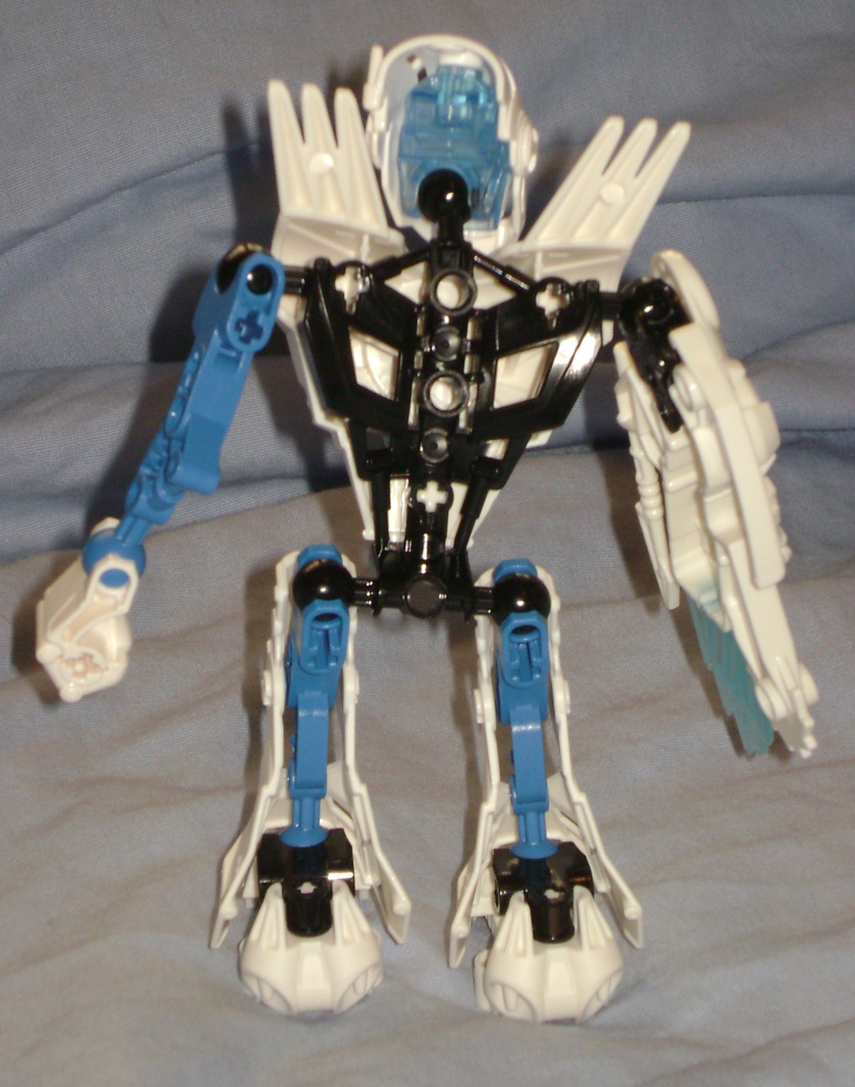
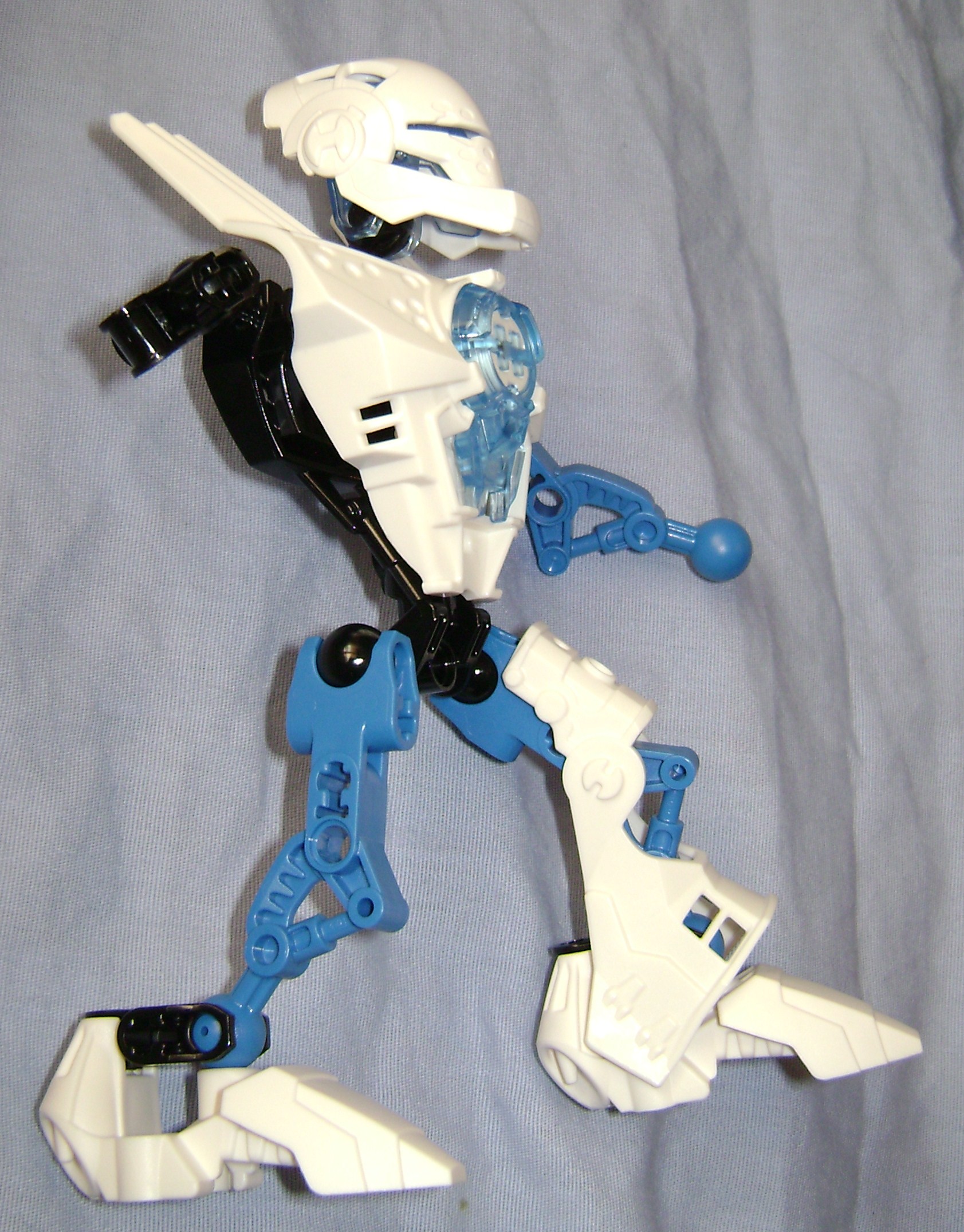
The finished product is strangely impressive, the leg armor, color, torso, helmet, everything just seems to come together very well, and I don’t think pictures and a review like mine would compare to having one in hand. It really makes me think that the LEGO® Company has taken it’s new buildable action figure in the right direction.
As much as I like this set, and it’s new parts, I am somewhat disappointed in a few details. The main thing I dislike is the big bulky arm with the molded in weapons, rather than an armored up arm with an articulated wrist and a detachable weapon. I also dislike that the knees do not bend, and that the torso could use something to keep it from wobbling around when you handle it. If you don’t mind these details, I can definitely recommend grabbing one of these Hero Factory sets to see for yourself.
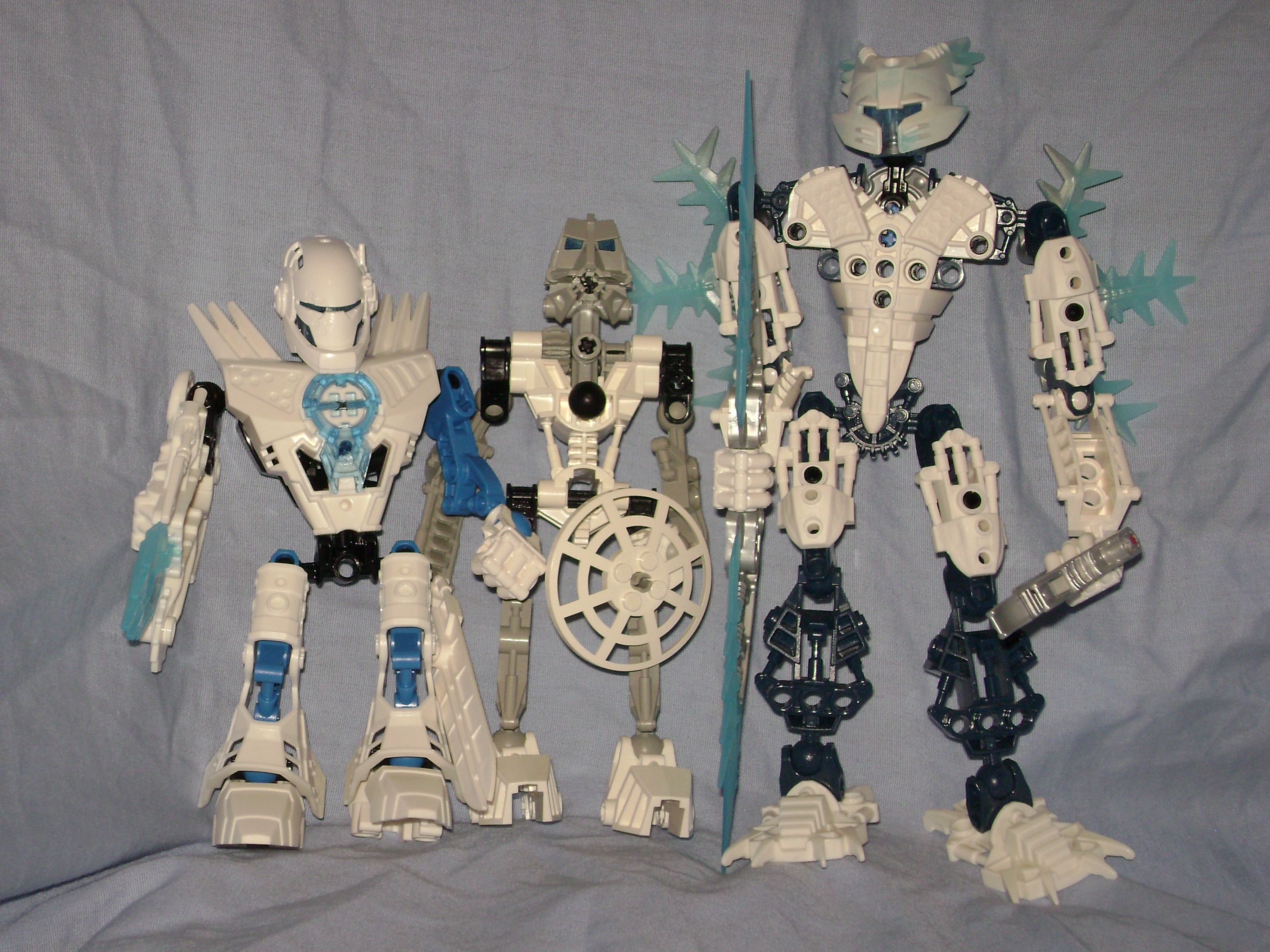
These new cannister sets are $7.99 USD, which is about the same price as the original Toa, maybe a dollar more. With that in mind, when you put Kopaka and Preston Stormer right next to eachother, Kopaka is only slightly taller if you count his height with his mask on. With the mask off, he’s about the same height, maybe even shorter than Preston. Now compare the arms and legs, and you will see that Preston shares much of the original toa design, except sacrificing the gear mechanism. They both have the unbending knees, a left arm with an articulated wrist, and the right arm with the one point of articulation (not counting Kopaka’s gear powered arm). Preston also has an asymmetrical mask that is more pronounced compared to the other heroes. However, Kopaka seems to be outclassed in articulation, and he looks rather bland right next to his streamlined counterpart. Comparing them both to Gelu, who was $12.99 USD, I have to wonder why we’ve been complaining about how expensive BIONICLE has become! They have gradually become taller and more massive over the years, so taking a moment to consider the recent sets are twice the size/mass, and the rising oil prices, we should really commend The LEGO Company for keeping the price down as long as they did. In short, I belive The LEGO Company has moved BIONICLE back to it’s roots with these heroes, and used the nine years of experience to give us a classic Toa with today’s parts. In the BIONICLE world, “Toa” means “Hero”, and I doubt its coincidence that this new line is called Hero Factory.
0 Comments