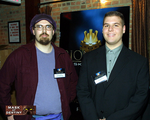
All of these photos of the MASK OF LIGHT party (Feb. 18th, 2003) were taken by the official event photographer and supplied to us by The LEGO® Company. The first shot shows a couple attendees posing in front of the official MASK OF LIGHT logo placard. On the right is Rich Manza from BZPower , and on the left is…um, on the left…well, whoever he is, he’s certainly wearing a righteous amount of purple. Oh right, that’s me! (My parents did their official duty and instilled an unreasonable amount of discomfort at the idea of being photographed, so I’m not quite that scary looking in real life. The other 90% is due to my natural weirdness aura.) This event marked the first time that representatives from MaskofDestiny and BZPower were in the same room together, as I had apparently left the showroom for my van appointment by the time Rich arrived on Sunday.

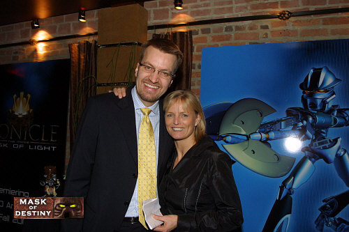
The second image shows the event’s two primary speakers, Stig Blicher (global brand director for BIONICLE™) and Conny Kalcher (LEGO® Company vice president and Executive Producer for BIONICLE™: MASK OF LIGHT, The Movie), posing with the GALI NUVA placard. While we don’t have images of the other three TOA NUVA placards, it’s interesting to note that GALI NUVA’s frame was slimmed down considerably to make it appear more feminine than those of her compatriots. I had a brief opportunity to chat with Mr. Blicher after the party ended while I was outside photographing the sidewalk light, and he sounded very excited about how well the idea of MASK OF LIGHT has been received by the fan community.

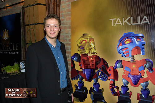
Finally, we have an image of Bob Thompson (co-creator of BIONICLE™ and Executive Producer for BIONICLE™: MASK OF LIGHT, The Movie) posing next to the MATORAN placard, which depicts JALA and TAKUA. While the TOA NUVA and TURAHK placards were neat to look at, the MATORAN placard was the true gem of the lot. Looking at the CGI forms, it’s very easy to see the child-like innocence that made the MNOLG MATORANS so endearing. It’s also easy to see why the toy design was altered to allow for significantly greater articulation, though I still feel it would have worked a lot better if they had actually incorporated new pieces to allow for a less bulky design.
While the first image is shared by MoD and BZP, the second and third images were supplied exclusively to this website, and two more were supplied solely to BZP, which can be viewed here .
0 Comments