MoC, Mahri Revamp
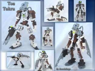
First place: “Bundalings”
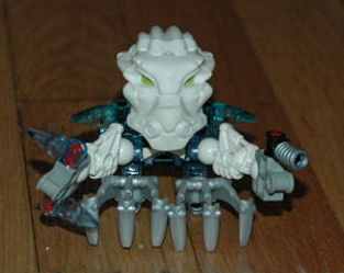
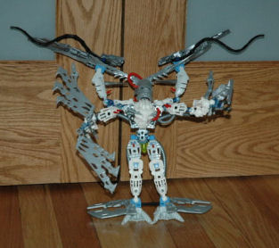
Editors Choice: Andrew House
Draw, A Toa’s Duty
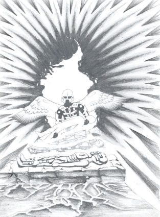
First Place: “Zanarh”
Editors Choice: None
Write, Glimpse Of A Toa
No Entrants
Comments
While we had plenty of entries for the MoC section, we had a sub par number of entries in the drawing category with no entrants for the written theme. The MoCing section was the most difficult to judge, especially when I narrowed it down to the last three entries for first place, and the last two entrants for editors choice. Zanarh’s entry for the artwork section was a very straight forward choice on the other hand, his drawing was very well done and posed allot to think about. No other entrants came close to giving him any competition, nor was there an entry to meet the criteria for editors choice in that category.
Bundaling’s entry, Toa Tukru, pulled its way to first place by having the best balance of differences while being recognizable as the same character, and the differences best reflected a change to an aquatic environment among the final three. With the other two entries originally tied with his, I found when I took away the labels an names on the entries, the before and after pictures of one entry looked like two completely different sub species, and while they were recognizably similar, I would have never guessed they were really the same being. It was like comparing a Tahnok to a Gahlok (Red and blue/Fire and water Bohrok). The other entry tied for first place was recognizably the same character without the labels, and looked pretty cool, but his upgrades didn’t seem to reflect a watery environment very much, at best he looked more streamlined but nothing made him look more aquatic in my eyes. So in the end Toa Tukru compared to his before and after pictures both looked like the same character with a good balance of differences, and the changes in his revamped form looked like they were sufficient for an underwater environment.
The final two entrants for editors choice gave me a rough time as well, they both looked built for an aquatic environment, each of them had eye catching details. Andrew’s eventually came on top because of the unique use of the Matoro Inika mask on each of his forms, combined with the tubes running through it and the Ignika mask, the color scheme, choice of parts, and tools which made me think of a coral reef, and how this set would fit right in. The other entry that I had narrowed it down to for editors choice was in contrast a mostly red color scheme that would stick out in the water, however it looked to me as though it belonged in the water and gave off the feel of a shark being on top of the food chain. It’s previous non aquatic form didn’t boast much except that it resembled it’s revamped form, and looking at the before and after pictures I’d say the guy looked like he was picked on and worked out till he could tear the ones pestering him in half.
As for contest winners who will be receiving a prize, Ill contact you in regards to that shortly, I’m still thinking about what Ill do with what I had budgeted for the writing contests prize since that category received no entries, Ill probably do something with it as soon as I’ve hammered out some other details. My plan is to give each winner their own MoC spotlight in a separate topic from this one, so Ill be working on that over the next couple weeks. After hosting two contests with multiple categories I think Ill stick to single category contests from now on since I always seem to get one or two sections with no entrants. I intended to make a contest everyone could enter even if they had no parts to work with, but I guess anyone visiting out site must have plenty of parts in the first place now that I think about it…


0 Comments